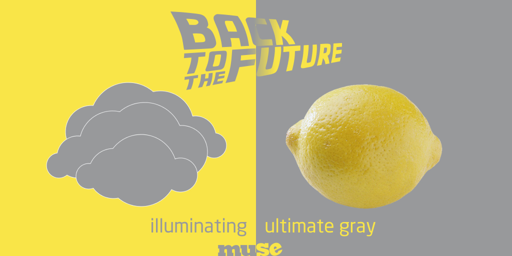
Pantone color (it’s American) of the year 2021
Colour predictions are a big event, and Pantone is a major influencer. Fashion brands, makers and interior designers will be gearing up to be on-trend, because colour is such an important part of how we express ourselves. Colour can make us feel more comfortable, more assured, more attuned. And these two colours will be woven into our lives next year, hoping to change the mood of us all.
Pantone announced that its 2021 Colors of the Year are ‘Ultimate Gray’ and ‘Illuminating’, shades chosen for their ‘warmth’ and ‘dependability’.
Are they warm?
The yellow is bright and cheerful, I’d say with a spring warmth – and the grey, well for a grey it isn’t harsh, as a CMYK breakdown it has plenty of magenta in, so I guess at a stretch you could say ‘warm’.
Are they dependable?
Just because they are the colour of spring sunshine and pebbles, or that we remember them from the noughties, or the 1950s – does that equal dependability? Interestingly, both are significant as being times when life was ‘getting back to normal’ after post-war rationing, and post financial crash, (‘Mimosa’ yellow was the 2009 colour) when hope was very much in demand – as it is now.
“In a time of economic uncertainty and political change, optimism is paramount and no other color expresses hope and reassurance more than yellow,” (Pantone 2009)
It’s unusual to get a double colour set. The last- and only time was back in 2016 when Pantone 15-3919 Serenity (a pale blue) and Pantone 13-1520 Rose Quartz (also known as ‘Millennial Pink’).
“… welcoming colors that psychologically fulfill our yearning for reassurance and security… challenges traditional perceptions of color association… gender blur” (Pantone 2016)
And it’s right that the colours are fresh, uplifting and easy to live with, because we are bored living with Covid-19 and all the happiness that it has wrung out of us.
But how should you use them?
Well, for one, don’t go changing your branding colours willy-nilly, these are fashion colours. You will not have much choice but to wear them as new clothes hit the shops next year. If you want to appear to have your finger on the fashion button – you can weave them lightly in to your palette – for say, social media posts, but only where they fit – you don’t want to look like everyone else now do you?
First impressions count, and colour is the first thing you notice in a logo or visual footprint – 80% of visual information is related to colour – it does so much work to tell your story before even getting to your logo, typography, image style, use of white space, your tone of voice, and use of language. So don’t go changing to yellow and or grey, or weaving it in, if it doesn’t suit you or your business.
And if you’re looking for printing colour breakdowns – because they aren’t called ‘Ultimate gray’, or ‘Illuminating’, nearest matches are Pantone 106, and Cool Gray 7.
‘Illuminating’ yellow = Pantone 106
- RGB 249 229 71
- HEX/HTML F9E547
- CMYK 1 0 79 0
‘Ultimate gray’ = Pantone Cool Grey 7
- RGB 151 153 155
- HEX/HTML 97999B
- CMYK 38 29 24 5
(calling it silver grey may have been more uplifting?)

