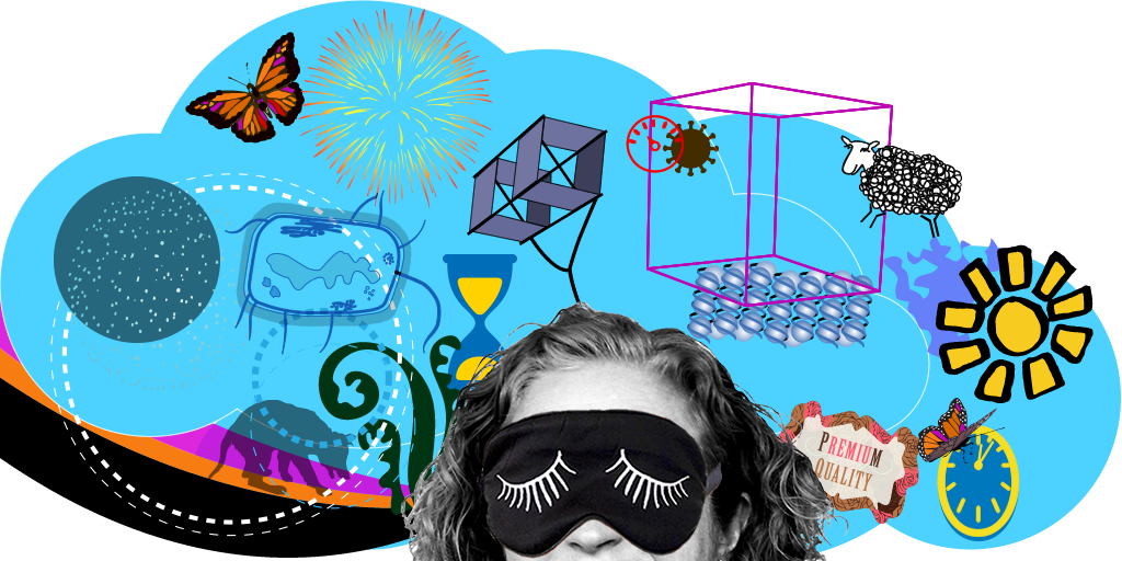
Solving design problems is my thing. I like to research by reading the brief, having a chat, sometimes seeing how others have solved the problem – although with logos I prefer not to do this for fear of influencing my quiet brain… but the one thing I have to do is…
sleep on it
By my bed you will find a sketchbook where I work through ideas before going to sleep, or to capture them as I fall into, or wake from, sleeping. If you can hold onto a question that you want to solve – your lovely brain has a whole night to try and figure out the answer for you.
Sometimes these are complete ideas, or they might be just notion of colour, or pattern, a phrase, or a feeling I need to explore.
feed the notion
To feed, or explore the fine threads of the awakening of an idea, I will start burrowing online or in the books of work by my favourite artists for inspiration, to connect the spaces between those first thoughts, or reject them. As I start to hone in on the ‘feeling’ I am trying to express – that I want to resonate in the final solution, shape and colour will also start to form. If it’s not quite there – I will again, sleep on it.
If you’ve ever worked with me, you may well have had an email that said something like:
‘I was up early because I thought this might work better’.
designing for yourself
In whatever field of expertise, the hardest problems to solve, are the ones for yourself. And they take the longest – hence the term ‘cobblers shoes’ – everyone but the cobbler has great shoes, which is why interestingly, quite often a big design agency will outsource their own visual branding – that way, it gets done, and they can be objective.
Which brings me to finding visual branding inspiration for my own website, especially that most important element, the main mast. I knew I needed a picture of me, because that’s what my clients buy. I also wanted to show that I was very ‘human’, so included a smile – a wry smile, because I will challenge! I also knew that it needed to say ‘something’ about me – my work is shown in the portfolio, and that speaks for itself. I found my inspiration in Milton Glaser (most famous for I ♥ NY) – notably the 1966 Bob Dylan’s Greatest Hits album cover. You can see it’s not a copy of the work, but I used a few cues from it. I wanted my design to make me feel happy, and full of promise, and not ‘as expected’ when I looked at it. So it has multi-colour swirls like Dylans’ hair, but used to block off the bottom of the image, it’s a bit ‘rainbow’ – because – who wants just one colour! I included the circles that I had been using in other graphics for myself; a bubble cloud for my thinking; a butterfly for those random ideas that can create big changes – it’s a monarch butterfly (with a bit of pink) – which is a pretty phenomenal creature. I am in black and white, supported by colour, and allowing free thinking. I still like it very much, but I will be compelled to make a change at some point. Because like my logo, which I’ve had since 1999 with a font tweak, I like to keep rolling.


