design, muse
First impressions count, and colour is the first thing you notice in a logo or visual footprint – 80% of visual information is related to colour. Pantone announced its colours for 2016, a pastel pink and blue. As a business purpose changes over time – this should be reflected in your visual footprint, you logo, your ‘look and feel’. Is your colour palette working for you? Does it need a seasonal tweak? Have a think, and then contact me to discuss!

festive, muse, newsletter
The older I get, the quicker Christmas seems to come around each year – is that the same for you? If in all your quickness, you don’t have a nice Christmas image to send out – I have three up for grabs. If none of these take your fancy – get in touch PD Quick and I’ll quickly make one for you!

branding, design, festive, muse
Don’t be a jive Turkey! Are you Going Cold Turkey on your current visual brand? Do you have a new project that you don’t want to be a Turkey? Lets Talk Turkey!
gleenings, LinkedIn, muse, newsletter, top tip
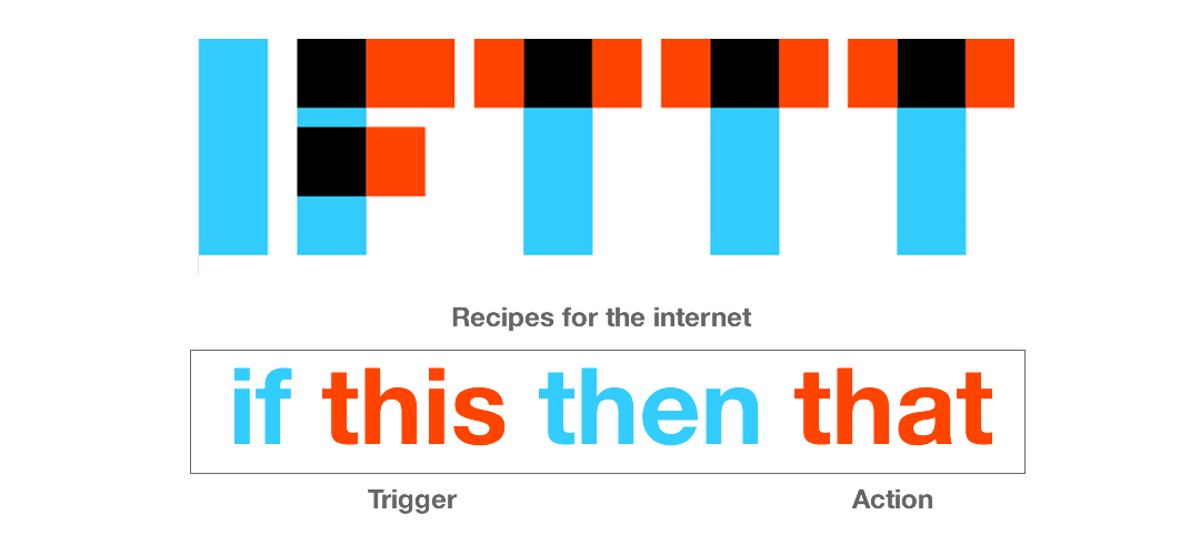
If This Then That – it does this and that so you don’t have to

festive, muse, newsletter, top tip
Festive Halloween muse-ings. Your treat – how to make Twitter summaries from your Wordpress site